Dec 12, 2024
The 60-30-10 rule in UI Design
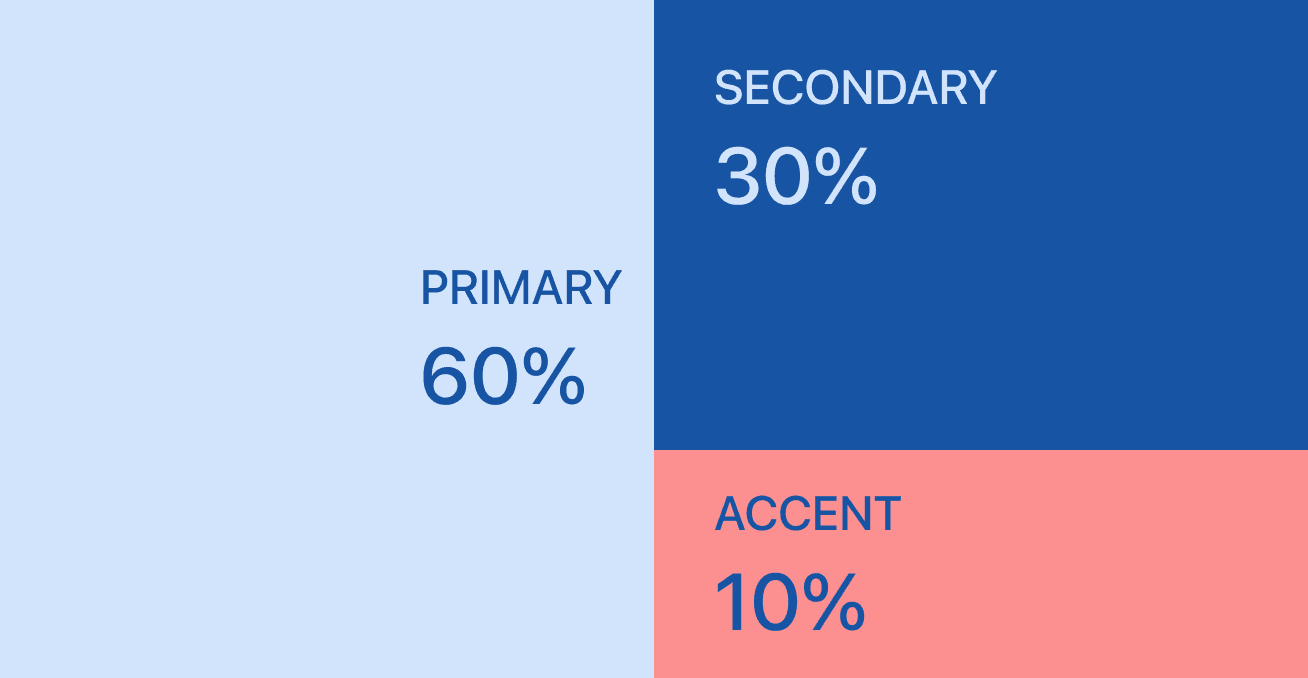
The 60-30-10 rule is a design principle often used in any design field, but it’s also highly applicable to UX/UI design to create visually appealing and well-balanced interfaces. It helps designers establish a harmonious color palette by proportionally distributing colors within a design.
60% (Dominant Color): This is the primary color that sets the overall tone or mood of the design. It typically covers the majority of the interface, such as the background or large sections, creating a consistent and cohesive visual foundation.
30% (Secondary Color): The secondary color complements the dominant color and is used to add contrast and variety. It’s often applied to components like menus, sidebars, or other significant elements to make the design more dynamic.
10% (Accent Color): The accent color is used sparingly to highlight specific elements, like buttons, links, or calls to action. Its purpose is to draw attention to key interactive components and guide the user's focus without overwhelming the design.
This approach simplifies decision-making when working with color and helps maintain consistency across the design system.